
Understanding how to analyze and describe pie charts representing water usage patterns across different regions stands as a fundamental skill for IELTS Writing Task 1 success. The usage of water chart questions frequently appear in the exam, requiring candidates to demonstrate their ability to interpret data, identify trends, and make meaningful comparisons between geographical areas and their water consumption patterns.
Water usage data typically reveals fascinating insights about how different regions prioritize their water resources, whether for agricultural irrigation, industrial processes, or domestic consumption. Mastering this chart type requires understanding both the visual representation and the underlying patterns that emerge when comparing water allocation across various global regions.
IELTS Writing Task 1 Usage of Water Chart Question Analysis
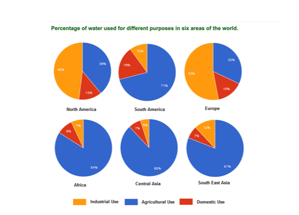
The charts below show the percentage of water used for different purposes in six areas of the world. Summarize the information by selecting and reporting the main features, and make comparisons where relevant.
This type of Task 1 question presents six pie charts, each depicting how water is allocated across three main sectors: agriculture, industry, and domestic use. Each chart corresponds to a different global region, and your job is to interpret these visuals, identify key regional patterns, and present accurate, high-level comparisons using formal academic writing. Rather than describing every data point, your response should focus on:
- Identifying the dominant patterns (e.g. agriculture as the largest water consumer in developing regions)
- Noting regional contrasts (e.g. industry dominating in North America and Europe)
- Grouping countries or regions based on similar usage trends
- Applying precise vocabulary to describe proportions and comparisons accurately
Examiners are assessing your ability to distill complex visual input into a well-organized report. Strong responses don’t just report statistics — they synthesize information across charts, highlight meaningful differences, and maintain coherence throughout.
Usage of Water Chart Model Responses: Progressive Band Achievements
Sample Answer 1
The pie charts illustrate the proportion of water consumed for agricultural, industrial, and domestic purposes across six global regions: North America, South America, Europe, Africa, Central Asia, and South East Asia.
Overall, the data reveals a clear distinction between developed and developing regions in their water allocation patterns. While North America and Europe prioritize industrial consumption, the remaining four regions demonstrate overwhelming agricultural dependence for their water resources.
North America and Europe exhibit remarkably similar consumption patterns, with industrial use dominating their water allocation. Europe allocates 53% of its water resources to industrial purposes, slightly exceeding North America’s 48%. Agricultural consumption accounts for approximately one-third of total usage in both regions (32% in Europe and 39% in North America), while domestic consumption remains relatively modest at 15% and 13% respectively.
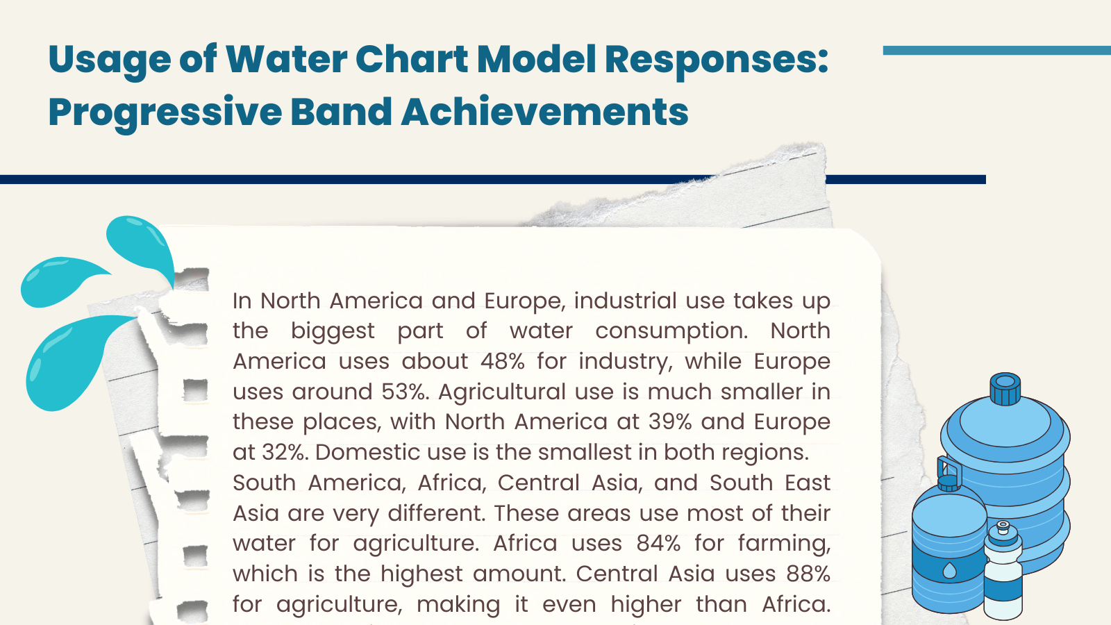
In contrast, the four developing regions show agricultural dominance in their water usage patterns. Central Asia demonstrates the highest agricultural dependency at 88%, followed closely by Africa at 84% and South East Asia at 81%. South America, while still agriculture-focused, shows somewhat lower agricultural consumption at 71%. Industrial usage remains minimal across these regions, ranging from merely 7% in Africa to 12% in South America. Domestic consumption varies between 7% and 19% across these four regions, with South America showing the highest domestic usage among developing areas.
Sample Answer 2
The pie charts delineate water consumption patterns across six distinct global regions, categorizing usage into agricultural, industrial, and domestic sectors, thereby revealing pronounced regional disparities in resource allocation strategies.
A striking dichotomy emerges between developed and developing regions, with the former prioritizing industrial applications while the latter demonstrate overwhelming agricultural dependence. This fundamental distinction reflects underlying economic structures and developmental priorities across different geographical areas.
Developed regions, specifically North America and Europe, exhibit comparable industrial-centric consumption patterns. Europe allocates the majority of its water resources to industrial purposes (53%), marginally surpassing North America’s industrial consumption (48%). Agricultural utilization constitutes approximately one-third of total consumption in both regions, with Europe at 32% and North America at 39%. Domestic consumption remains proportionally modest, representing 15% and 13% respectively.
Conversely, developing regions demonstrate pronounced agricultural dependency, with Central Asia exhibiting the most extreme agricultural concentration at 88% of total water consumption. Africa follows closely with 84% agricultural allocation, while South East Asia dedicates 81% to farming activities. South America, though still agriculture-dominant, displays relatively diversified consumption at 71% agricultural use. Industrial consumption across these regions remains negligible, fluctuating between 7% in Africa and 12% in South America. Domestic usage varies considerably, ranging from 7% in Central Asia to 19% in South America, suggesting different population densities and urbanization levels.
Analytical Framework for Usage of Water Charts
To strengthen your analytical writing skills, explore more examiner-evaluated guides and Band 9 samples at IELTS Sample Banks, where each IELTS Writing Task 1 topic — from bar graphs to maps — is explained step by step.
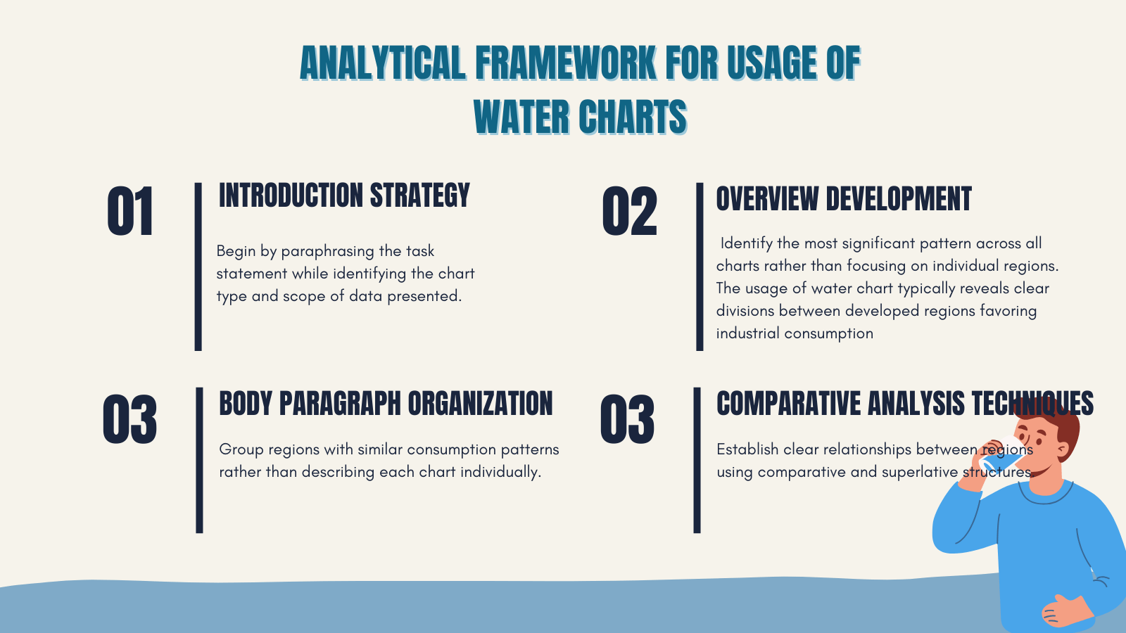
- Introduction Strategy: Begin by paraphrasing the task statement while identifying the chart type and scope of data presented. Transform “show the percentage of water used” into “illustrate the proportion of water consumed” or “delineate water allocation patterns” to demonstrate lexical flexibility and avoid direct copying from the question prompt.
- Overview Development: Identify the most significant pattern across all charts rather than focusing on individual regions. The usage of water chart typically reveals clear divisions between developed regions favoring industrial consumption and developing regions prioritizing agricultural use. This overarching trend should form the foundation of your overview statement.
- Body Paragraph Organization: Group regions with similar consumption patterns rather than describing each chart individually. This approach demonstrates analytical thinking and makes comparisons more natural and coherent. Consider organizing data by dominant usage type or geographical-economic categories to create logical paragraph structures.
- Comparative Analysis Techniques: Establish clear relationships between regions using comparative and superlative structures. Highlight the most extreme examples (highest agricultural dependency, lowest industrial usage) while noting regions that deviate from general patterns to add nuance to your analysis.
Comprehensive Vocabulary for Usage of Water Chart
| Category | Basic Terms | Intermediate Options | Advanced Alternatives |
| Amounts | percentage | proportion | allocation |
| amount | share | distribution | |
| quantity | portion | apportionment | |
| volume | extent | quota | |
| number | part | allotment | |
| portion | fraction | ||
| Comparisons | higher | considerably greater | substantially exceeds |
| lower | marginally less | negligible difference | |
| similar | relatively greater | far superior | |
| equal | markedly higher | vastly inferior | |
| different | noticeably higher/lower | noticeably higher | |
| Trends | shows | demonstrates | exemplifies |
| represents | indicates | illustrates | |
| depicts | reveals | delineates | |
| highlights | reflects | unveils | |
| presents | illustrates | reveals | |
| signifies | portrays | ||
| Emphasis | most | predominantly | overwhelmingly |
| least | primarily | predominantly | |
| main | chiefly | marginally | |
| major | largely | chiefly | |
| important | mostly | substantially | |
| Precision | about | approximately | precisely |
| around | roughly | exactly | |
| near | close to | virtually | |
| roughly | about | narrowly | |
| approximately | close to | impeccably | |
| rigorously |
Strategic Approach to Excellence
Successful usage of water chart analysis requires systematic preparation and strategic thinking. Focus on identifying patterns rather than memorizing specific percentages, as different charts present varying data while maintaining similar structural approaches. Practice grouping regions by consumption patterns and developing smooth transitions between comparative statements.
Develop your ability to synthesize information from multiple charts simultaneously, as this skill distinguishes higher-scoring responses from basic descriptions. Remember that accuracy in data reporting combined with sophisticated language use creates the foundation for achieving your target band score.
If you’re interested in environmental topics, check out the IELTS Geothermal Energy Diagram, Hydroelectricity Diagram and Water Filtration Diagram which develops your academic vocabulary for sustainability contexts.