
When tackling IELTS Writing Task 1, understanding how to analyze and describe pie charts becomes essential for achieving your target band score. The pie chart of water usage in India represents a common data visualization format that tests your ability to interpret statistical information and present it coherently in IELTS Academic Writing Task 1.
This comprehensive guide will walk you through the process of crafting high-scoring responses, providing you with model essays across different band levels and the analytical tools needed to excel in your IELTS examination.
Pie Chart of Water Usage in India IELTS Question Analysis
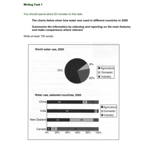
The charts below show how water was used in different countries in 2000. Summarise the information by selecting and reporting on the main features, and make comparisons where relevant.
The pie chart task requires you to examine the water consumption patterns and identify the most significant trends and contrasts. Your response for “pie chart of water usage in india” report must demonstrate the ability to select relevant data points, organize information logically, and present comparisons using appropriate academic language.
Understanding the requirements involves recognizing that you need to paraphrase the question, provide an overview of the main trends, and analyze specific data with supporting details. The timeframe specified (2000) should be acknowledged, and any striking differences between categories must be highlighted effectively.
3 Model Responses for Pie Chart of Water Usage in India
The pie chart below illustrates how water was used in India in the year 2000, divided into three main sectors: agriculture, domestic use, and industry. Below are three sample responses representing different proficiency levels, so you can see how task performance improves with more precise language, better organization, and deeper analysis.
Model Answer 1:
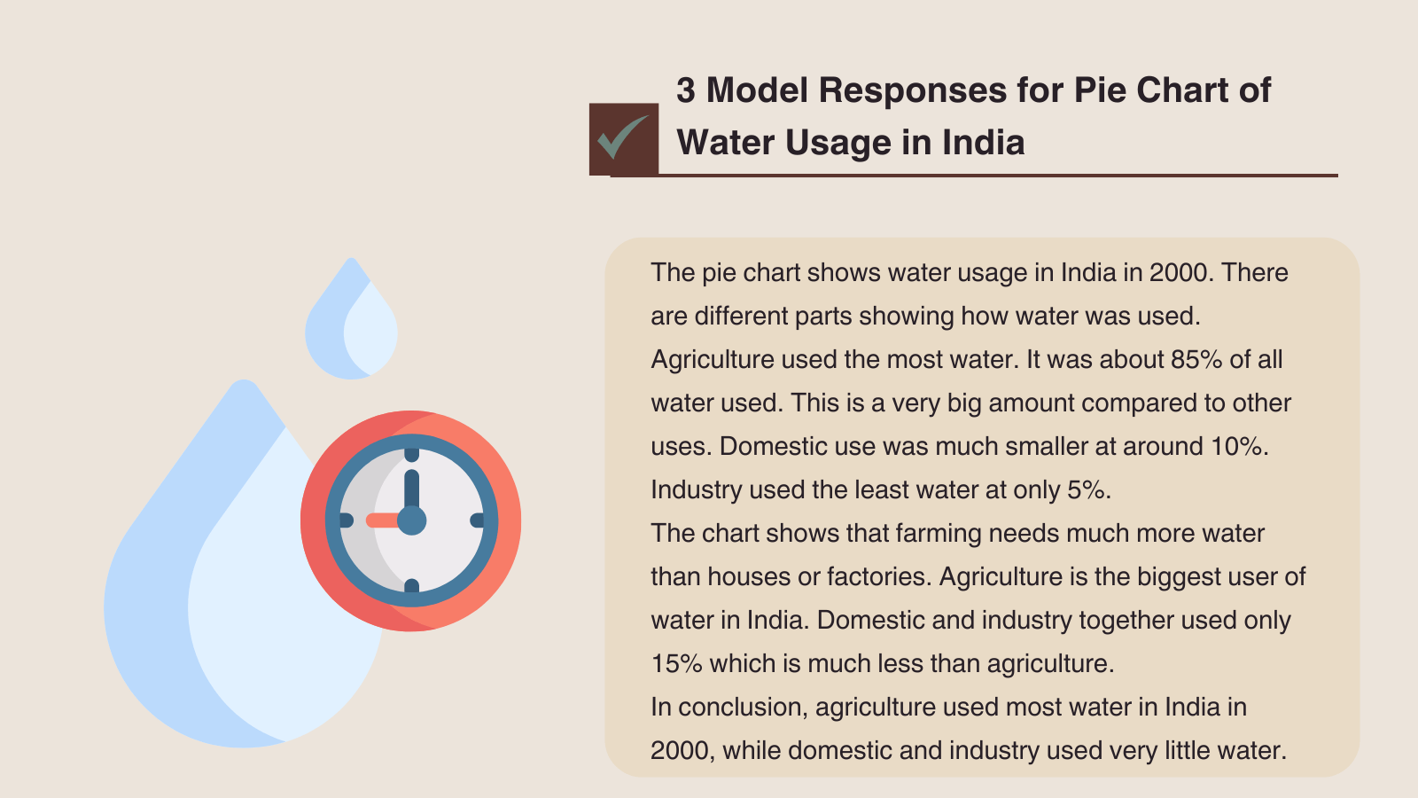
The pie chart shows water usage in India in 2000. There are different parts showing how water was used.
Agriculture used the most water. It was about 85% of all water used. This is a very big amount compared to other uses. Domestic use was much smaller at around 10%. Industry used the least water at only 5%.
The chart shows that farming needs much more water than houses or factories. Agriculture is the biggest user of water in India. Domestic and industry together used only 15% which is much less than agriculture.
In conclusion, agriculture used most water in India in 2000, while domestic and industry used very little water.
Model Answer 2:
The pie chart illustrates the distribution of water consumption across different sectors in India during the year 2000, revealing significant disparities in usage patterns.
Overall, agriculture dominated water consumption, accounting for approximately 85% of total usage, while domestic and industrial sectors represented considerably smaller proportions. The data demonstrates the overwhelming dependence on water resources for agricultural purposes compared to other applications.
Agriculture constituted the largest segment of water consumption, utilizing more than four-fifths of available resources. This substantial allocation reflects India’s agricultural economy and the intensive irrigation requirements for crop production. In contrast, domestic consumption represented a modest 10% of total water usage, indicating relatively limited household demand during this period.
Industrial water consumption occupied the smallest segment at merely 5% of total usage. This minimal industrial allocation suggests either efficient water management practices or a less developed manufacturing sector compared to agricultural activities. The combined domestic and industrial consumption totaled only 15%, highlighting the agricultural sector’s predominance in water resource allocation.
Model Answer 3:
The pie chart delineates water allocation patterns across three primary sectors in India for the year 2000, revealing stark disparities in resource distribution and highlighting the agricultural sector’s overwhelming dominance in national water consumption.
The data presents a pronounced concentration of water usage within agriculture, which commands an overwhelming 85% of total national consumption. This figure substantially exceeds the combined allocation for domestic and industrial purposes, which together constitute merely 15% of overall water resources, thereby underscoring the critical role of irrigation and agricultural processes in India’s water economy.
Agricultural water consumption represents the most substantial component, utilizing more than four-fifths of available resources and reflecting the sector’s intensive irrigation requirements for sustaining crop production across diverse climatic zones. This substantial allocation demonstrates the fundamental dependency of India’s largely agrarian economy on extensive water resources for maintaining food security and rural livelihoods.
Conversely, domestic water consumption accounts for a comparatively modest 10% of total usage, suggesting either efficient household water management or limited access to water infrastructure in certain regions. Industrial consumption occupies the smallest proportion at 5%, indicating either sophisticated water recycling technologies within manufacturing processes or a relatively underdeveloped industrial base compared to agricultural activities. The minimal combined contribution of domestic and industrial sectors emphasizes agriculture’s disproportionate influence on national water resource allocation patterns.
Systematic Analysis Framework for Task 1 Success
To achieve a high band in IELTS Writing Task 1, your response must go beyond accurately stating figures — it should demonstrate the ability to summarize, structure, and connect information effectively. The framework below provides a clear method for analyzing pie charts, using the “Water Usage in India (2000)” chart as a working example.
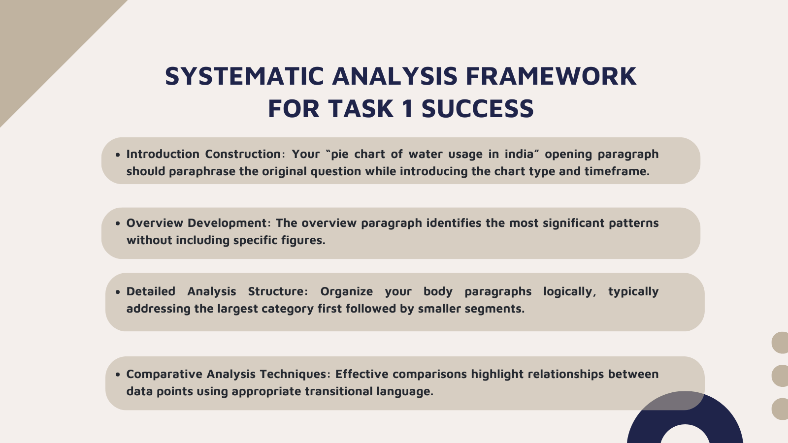
- Introduction Construction:
Your “pie chart of water usage in india” opening paragraph should paraphrase the original question while introducing the chart type and timeframe. Effective paraphrasing involves changing key terms like “shows” to “illustrates” or “depicts,” and “water usage” to “water consumption” or “water allocation.” This demonstrates your lexical range while maintaining clarity about the data being analyzed.
- Overview Development:
The overview paragraph identifies the most significant patterns without including specific figures. Focus on the dominant trend (agriculture’s overwhelming share) and the notable contrast between sectors. This section should provide readers with a clear understanding of the main story the data tells before examining specific details.
- Detailed Analysis Structure:
Organize your body paragraphs logically, typically addressing the largest category first followed by smaller segments. When discussing the pie chart of water usage in India, begin with agriculture’s dominance, then examine domestic and industrial consumption patterns. Each paragraph should include specific percentages while explaining their significance within the broader context.
- Comparative Analysis Techniques:
Effective comparisons highlight relationships between data points using appropriate transitional language. Phrases like “in stark contrast,” “conversely,” and “by comparison” help establish clear relationships between different sectors while demonstrating your ability to synthesize information rather than simply listing figures.
To expand your skills and see how similar techniques apply to different topics, explore these sample essays and guides:
-
Balanced Diet Pie Chart with Percentages – shows how to describe nutritional data and compare macronutrient proportions effectively.
-
Food Pie Chart Percentages – demonstrates data grouping and comparison strategies in food-related tasks.
Most Common and Useful Vocabulary for Pie Chart of Water Usage in India
| Function | Basic (B1-B2) | Intermediate (B2-C1) | Advanced (C1-C2) |
| Describing Proportions |
|
|
|
| Percentage Language |
|
|
|
| Size Comparisons |
|
|
|
| Data Presentation |
|
|
|
| Trend Description |
|
|
|
Academic Verbs for Data Description:
| Purpose | Vocabulary Options | Example Usage |
| Showing Data |
|
“The chart depicts regional consumption patterns” |
| Making Up/Forming |
|
“Agriculture encompasses the majority of water usage” |
| Indicating Trends |
|
“The data manifests significant sectoral disparities” |
| Expressing Dominance |
|
“Agricultural consumption eclipses all other sectors” |
| Highlighting Contrasts |
|
“Industrial usage diverges markedly from agricultural patterns” |
Sophisticated Comparison Language:
| Comparison Type | Basic Terms | Advanced Alternatives |
| Much Larger | much bigger | substantially greater, considerably more extensive, significantly more pronounced |
| Slightly More | a bit more | marginally higher, fractionally greater, incrementally superior |
| Equal | the same as | equivalent to, comparable with, analogous to, commensurate with |
| Much Smaller | much smaller | substantially lower, considerably less significant, markedly inferior |
| Opposite | different from | contrary to, inverse to, antithetical to, diametrically opposed |
With the vocabulary lists above, ieltssamplebanks.com hope you can express complex data relationships with precision while demonstrating the lexical sophistication required for higher band scores for pie chart of water usage in india report. The key lies in natural integration of these terms rather than forced inclusion that compromises clarity.
Strategic Approach to Excellence
Success in IELTS Writing Task 1 pie chart of water usage in india requires systematic preparation combining analytical skills with linguistic precision. Regular practice with diverse chart types builds confidence while expanding your descriptive vocabulary repertoire.
Focus on identifying significant patterns quickly and organizing information logically within time constraints. Remember that achieving higher band scores depends on accurate data reporting, sophisticated language use, and coherent organization. Your goal should be presenting complex information clearly while showcasing English proficiency through varied vocabulary and sentence structures.